JAN
2016 Kitchen & Bath Industry Show Wrap Up
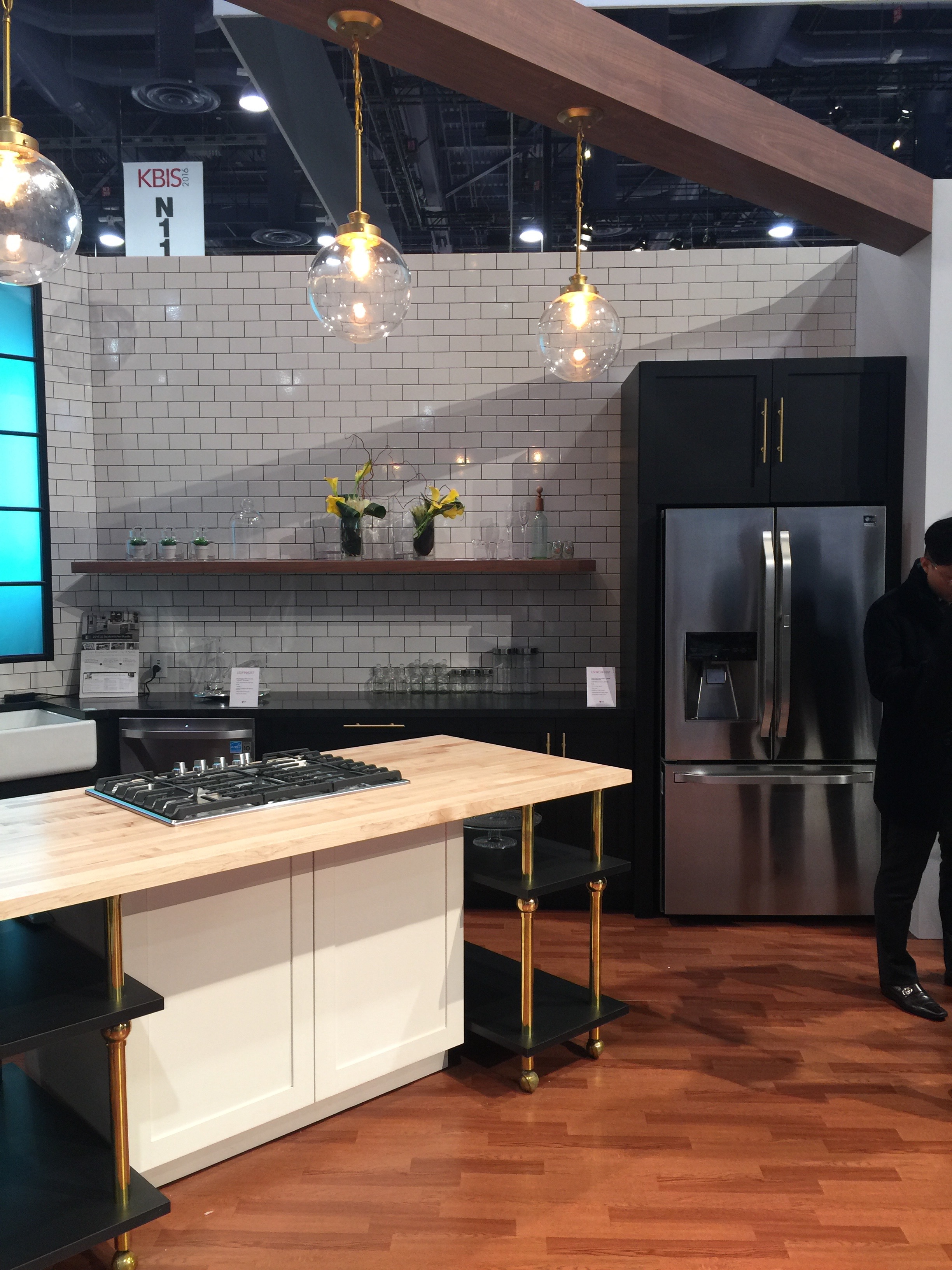
Last week we spent a few days at the 2016 Kitchen & Bath Industry Show / International Builders Show (KBIS/IBS) in Las Vegas. The show is meant to exhibit all of the latest and greatest products, manufacturers, and my favorite part–trends for the coming year! It basically serves as the home builder’s fashion week. While we did have a little fun, it is Vegas after all! We are back and here are the highlights!
The king of the jungle this year was surfaces. Everything from cabinet fronts, countertops, metals, tile, even laminates (seriously!). The industry is focusing on how to use existing products differently and creating new products (yay science!) that are more durable, lighter, versatile, and affordable.
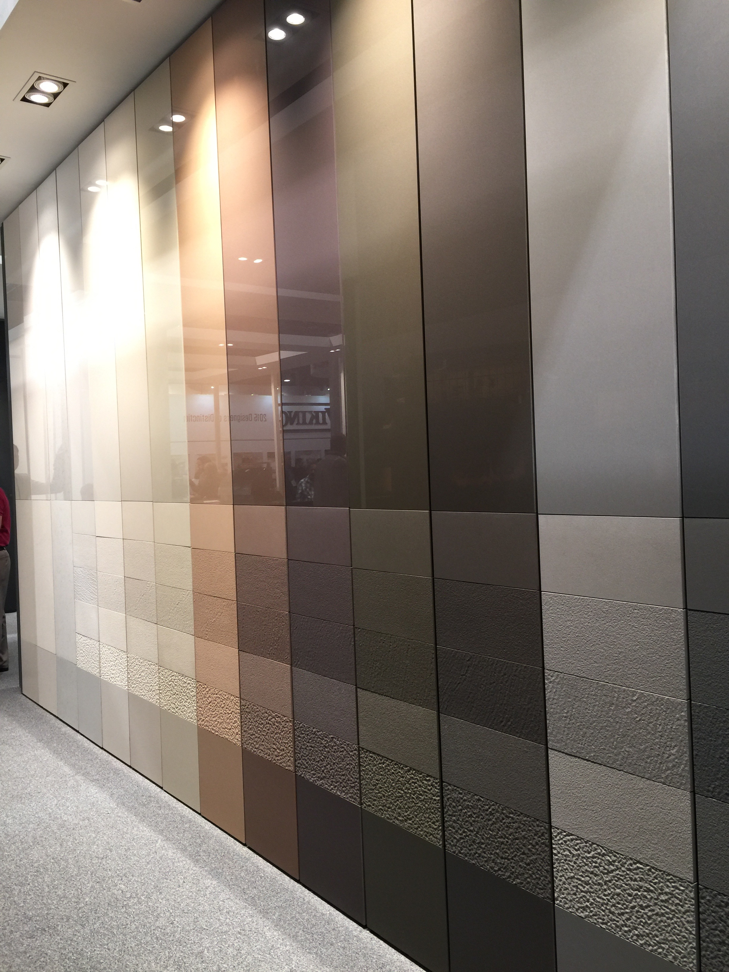
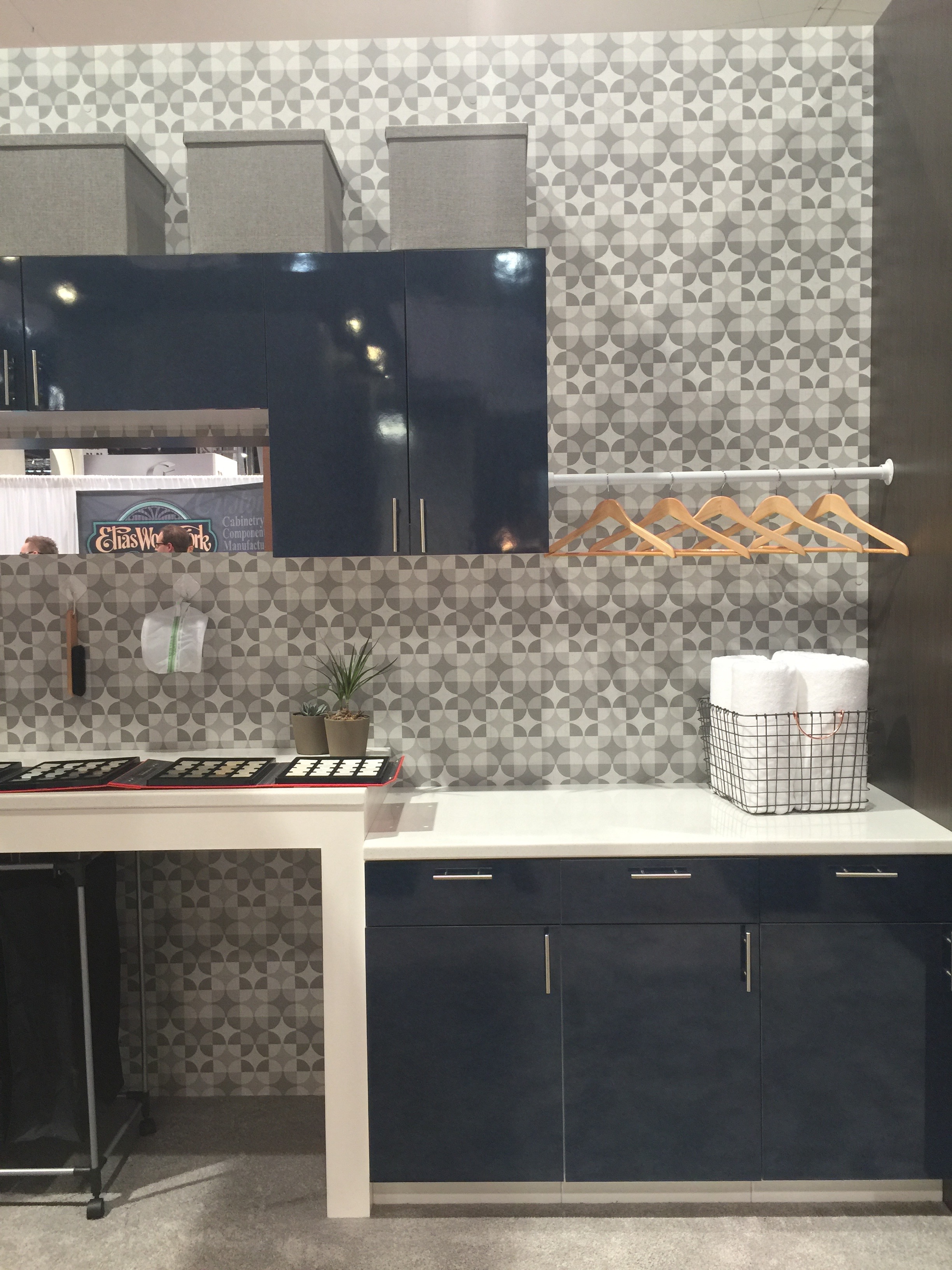
Cabinet fronts are seeing engineered textures that allow for a variety of different looks. Want bleached barn wood cabinets without the splinters? No problem with new rustic textured laminates. Or perhaps you prefer a bold color in a high gloss finish? New acrylic doors are stronger than ever so they look good even after life happens. Metal and glass doors are also gaining in popularity.
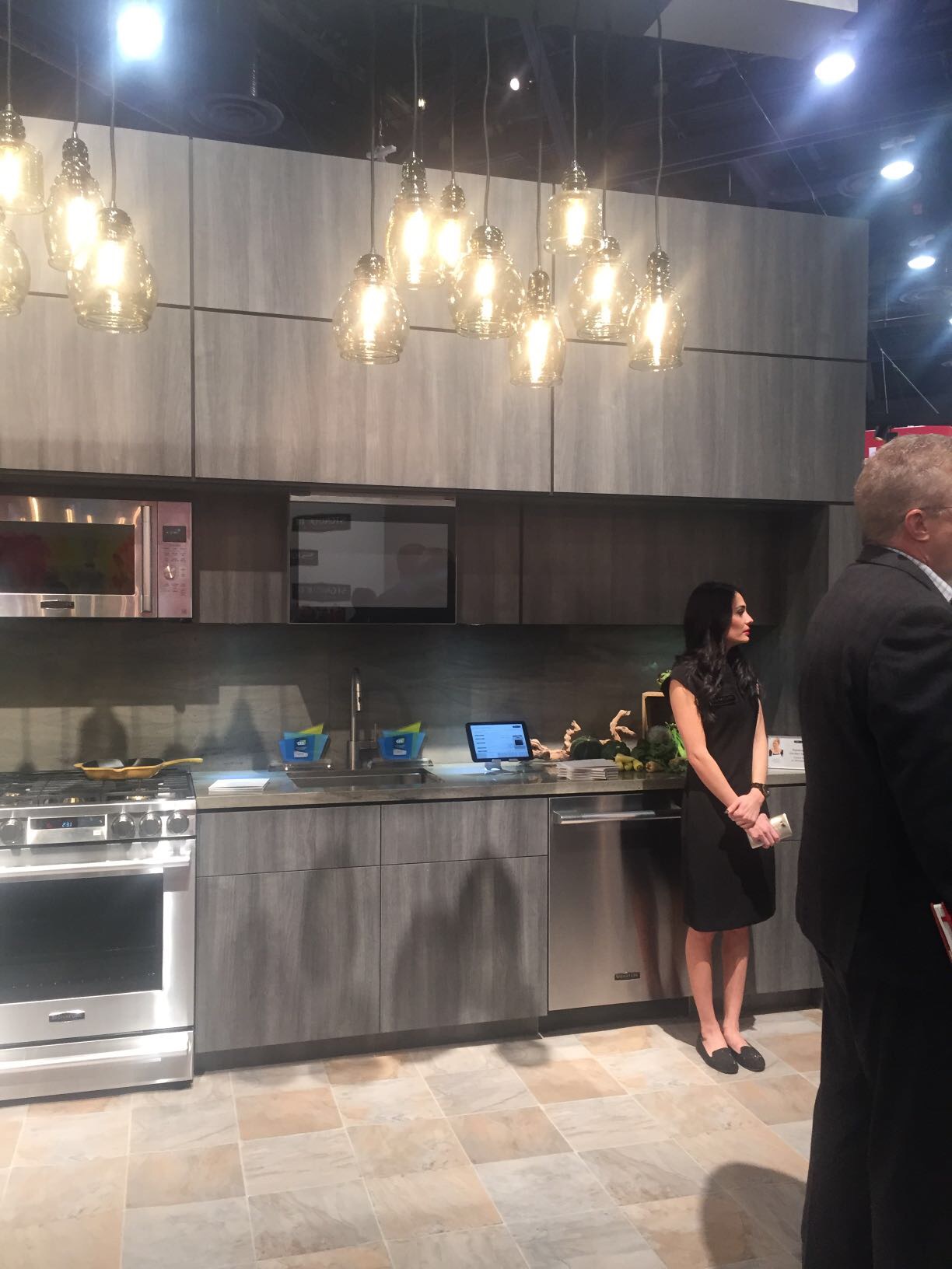
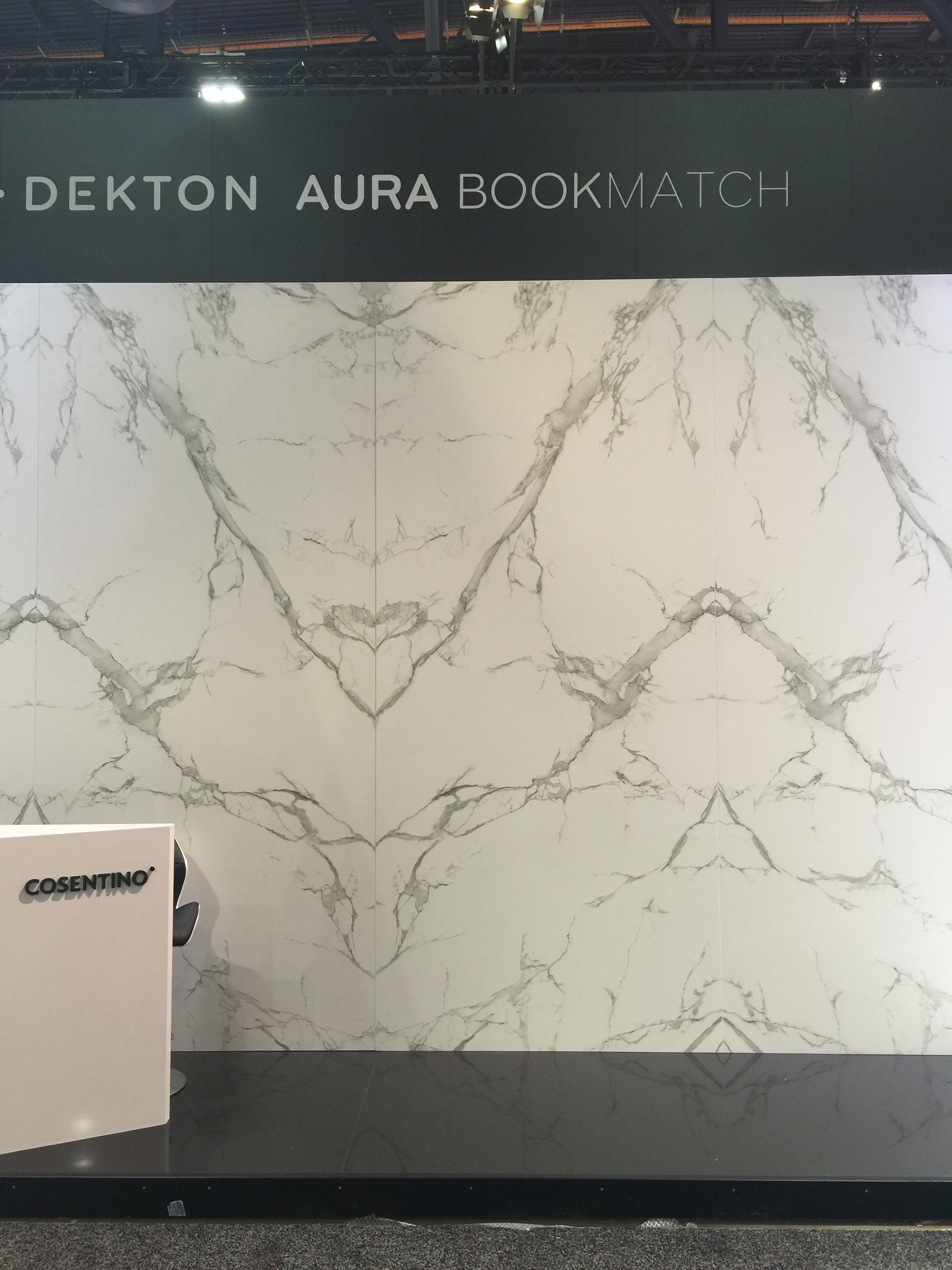
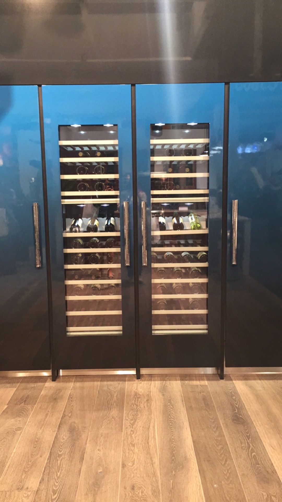 Countertop materials like quartz are making huge strides and really starting to change the game of surfaces. Thinner than ever these materials that have previously been limited to horizontal spaces are now climbing the walls!
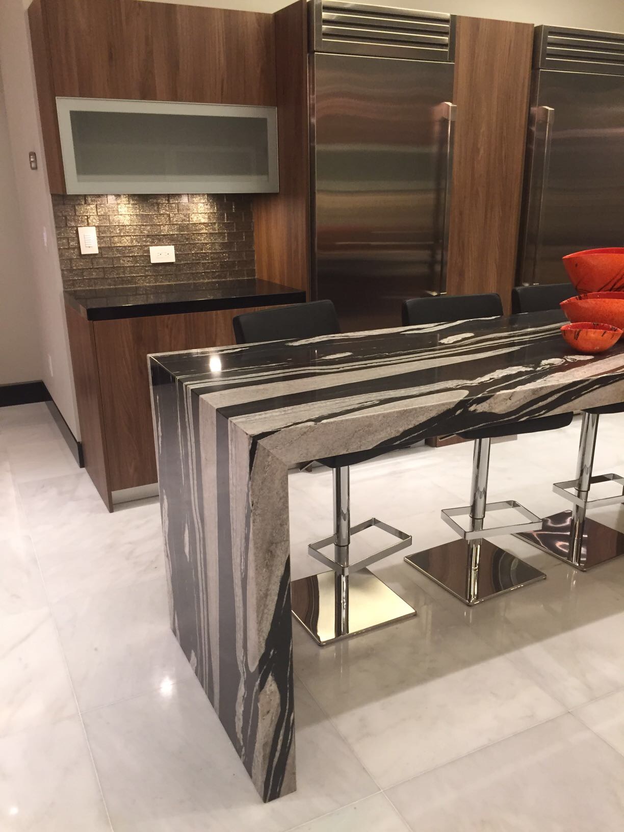
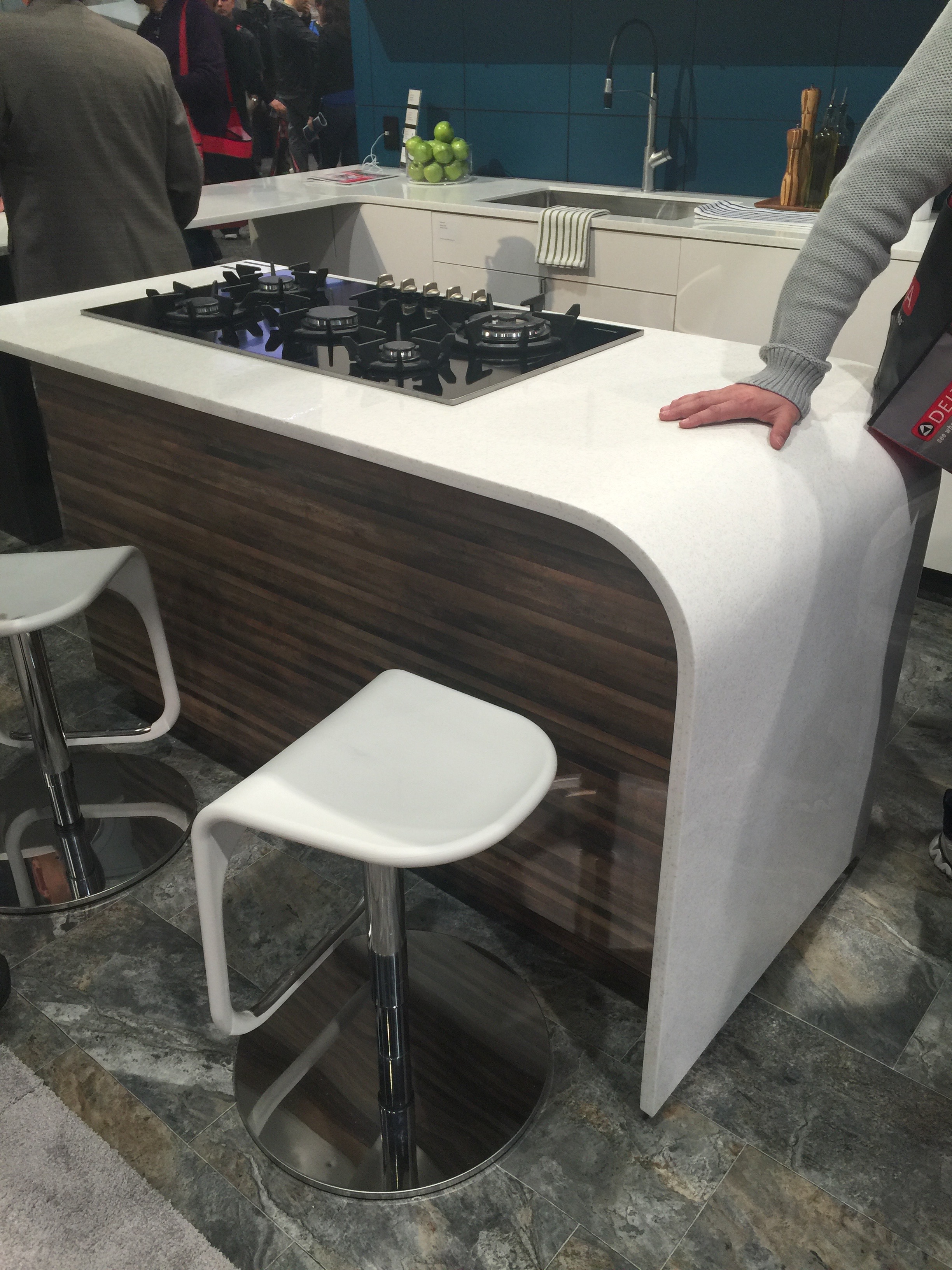
Being able to create almost any combination of colors and patterns I find I’m using natural stones like granite and marble less and less. Features like waterfall countertops, although around for several years now, will definitely continue to grow in popularity.
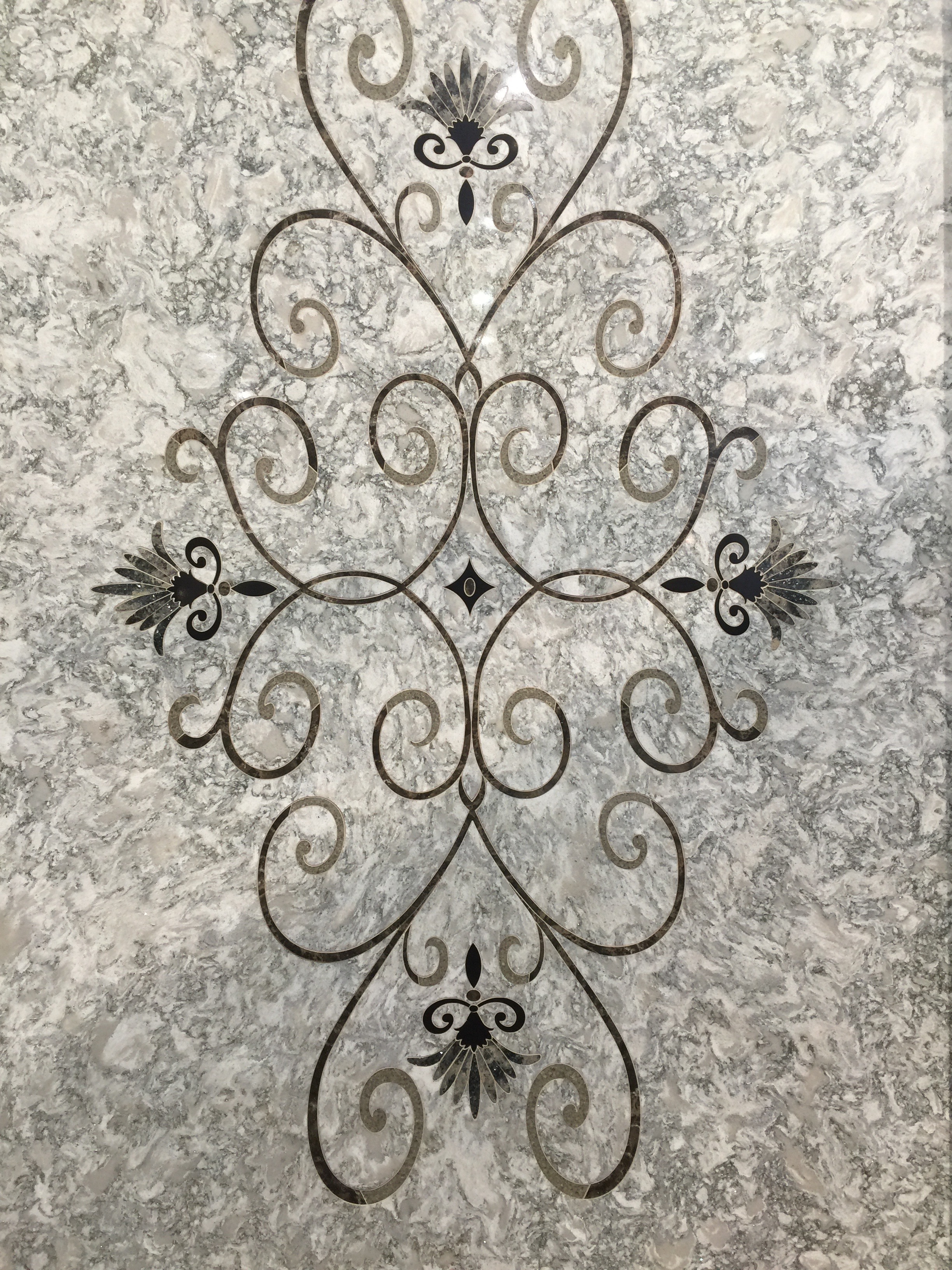
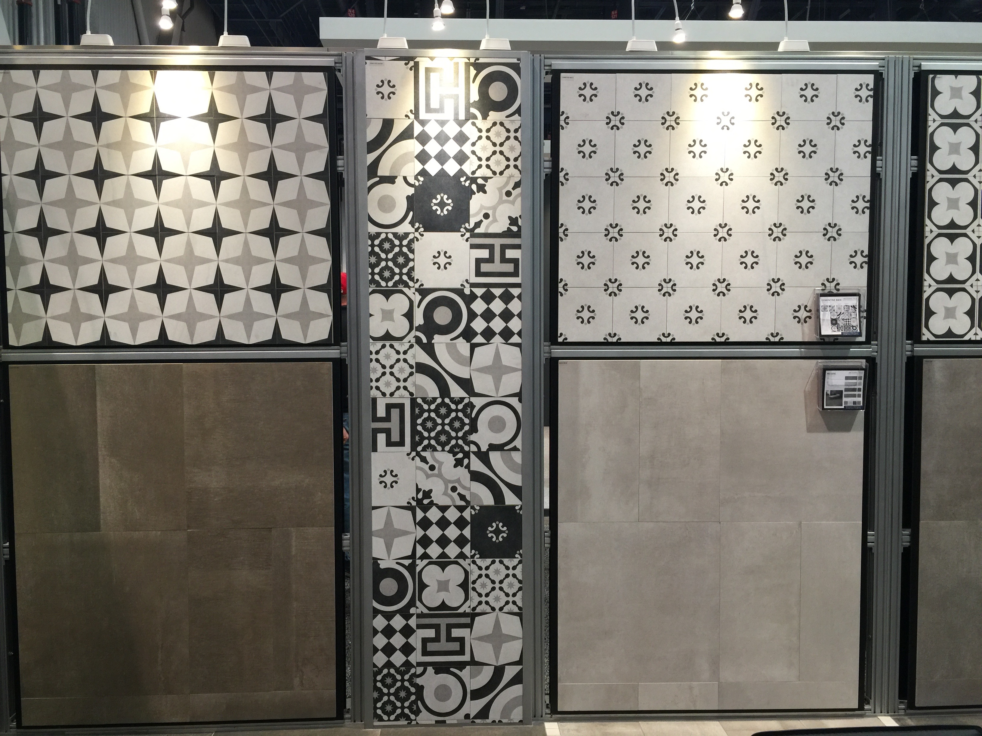
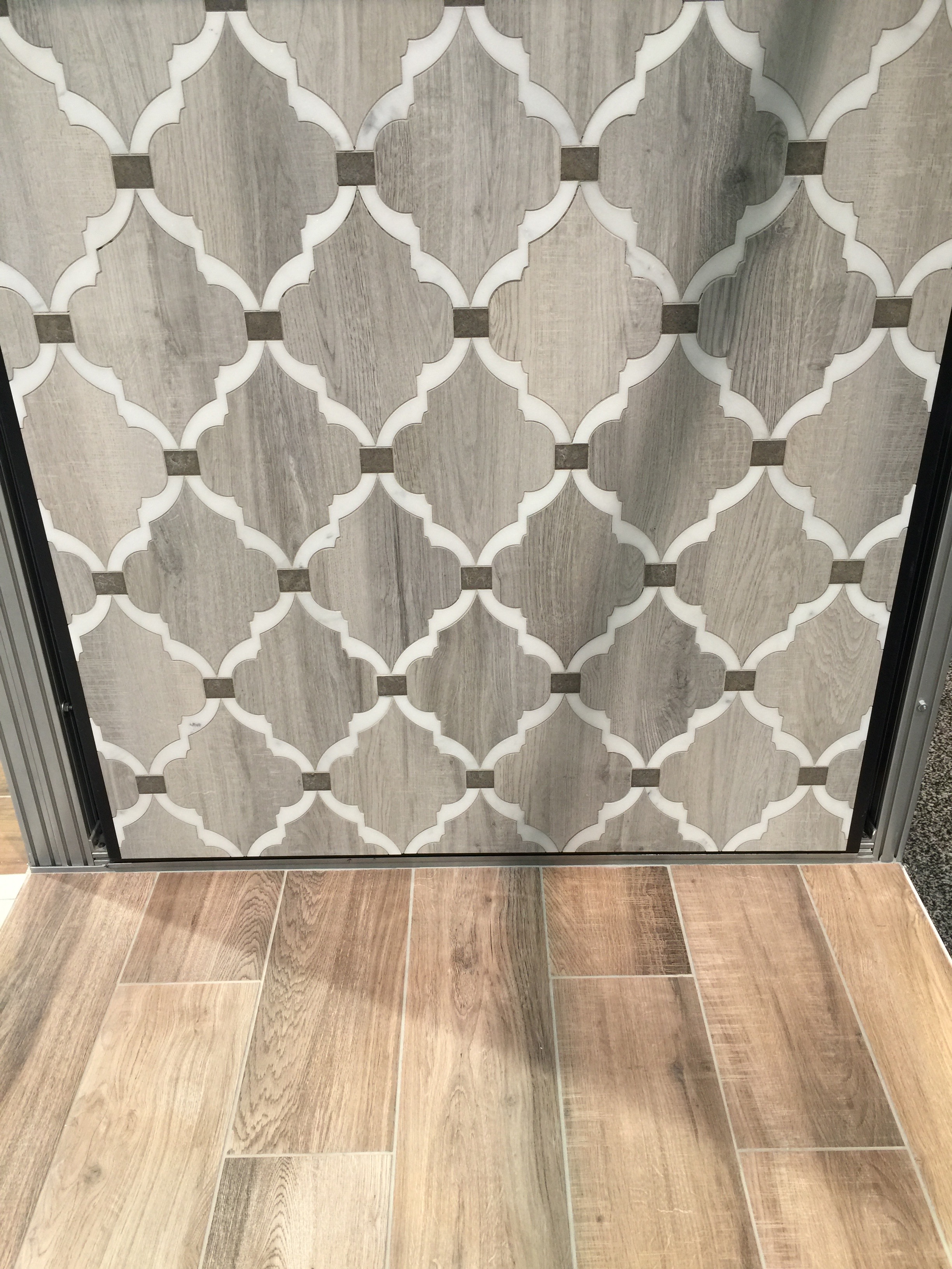
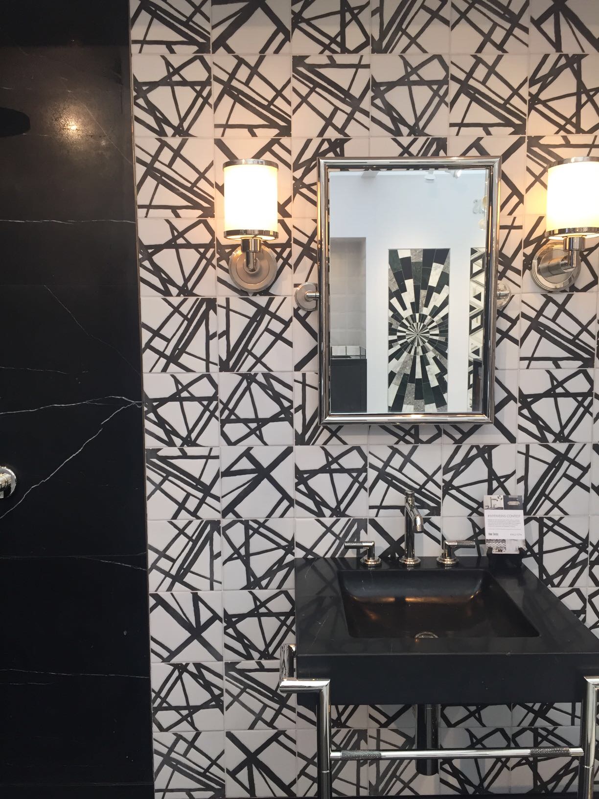
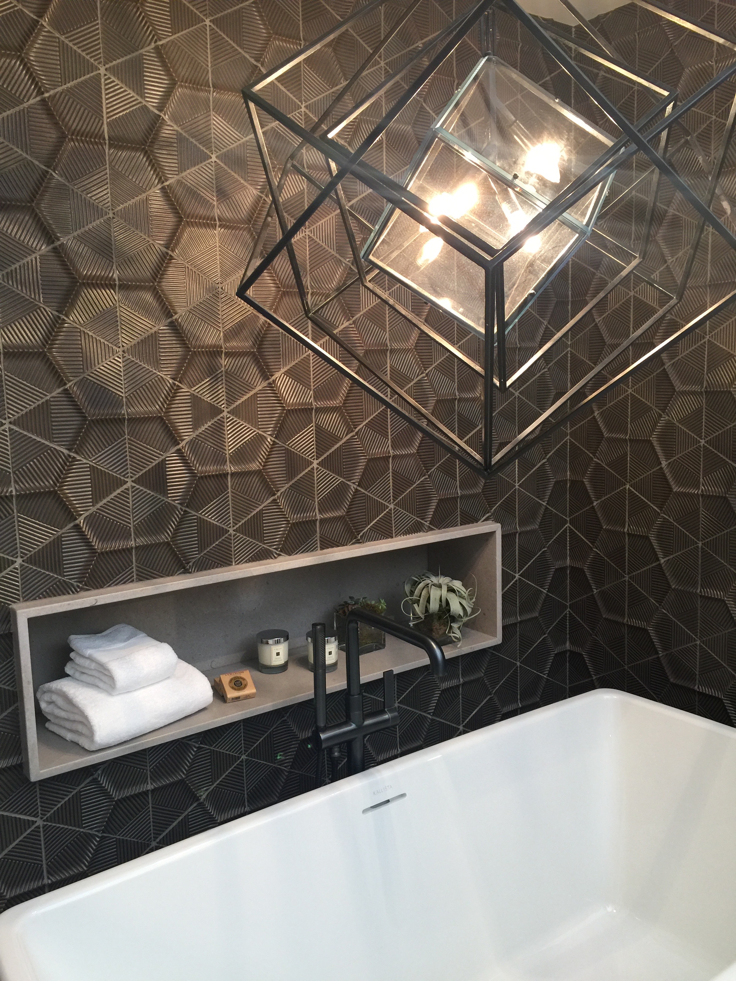
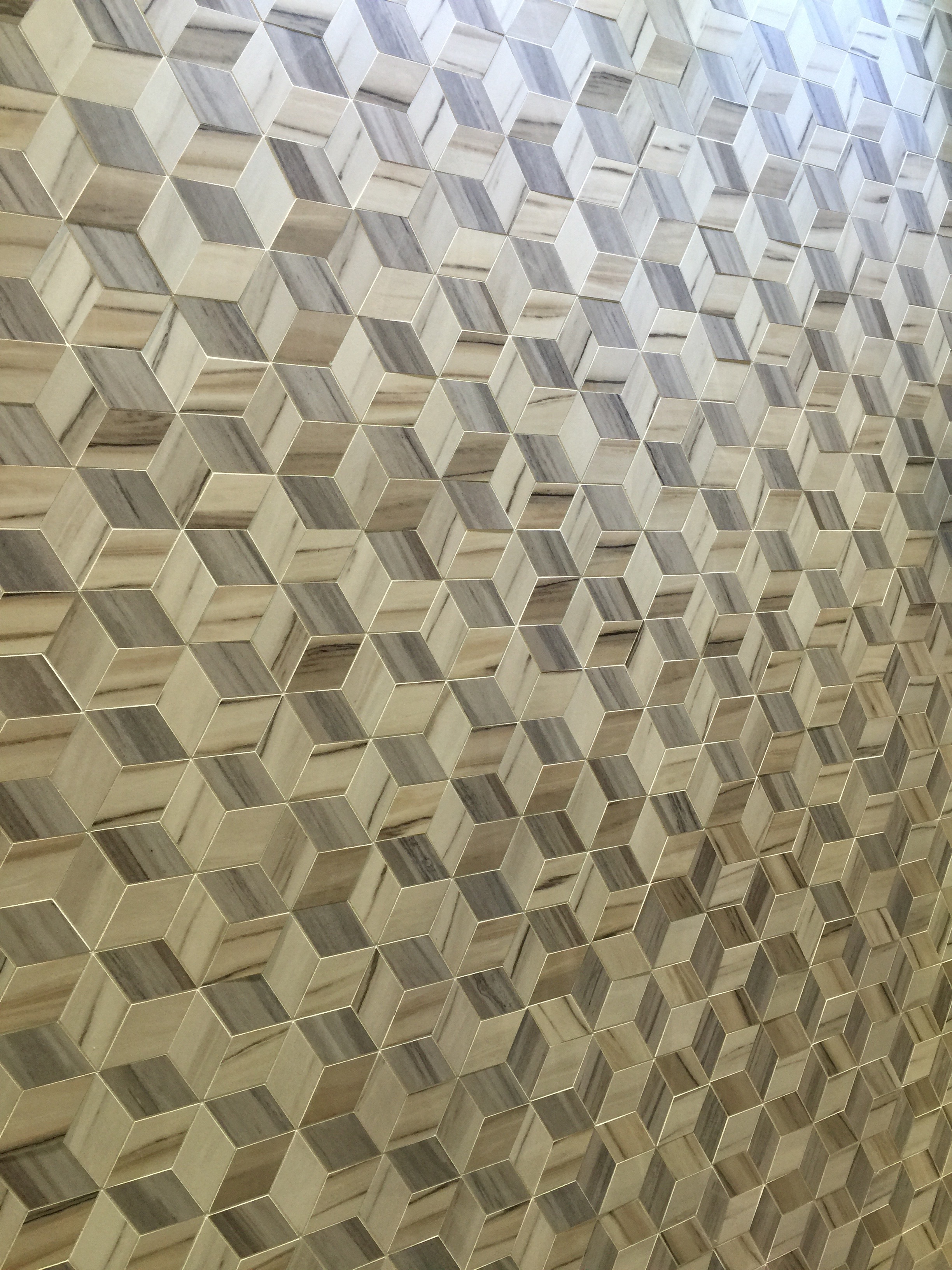
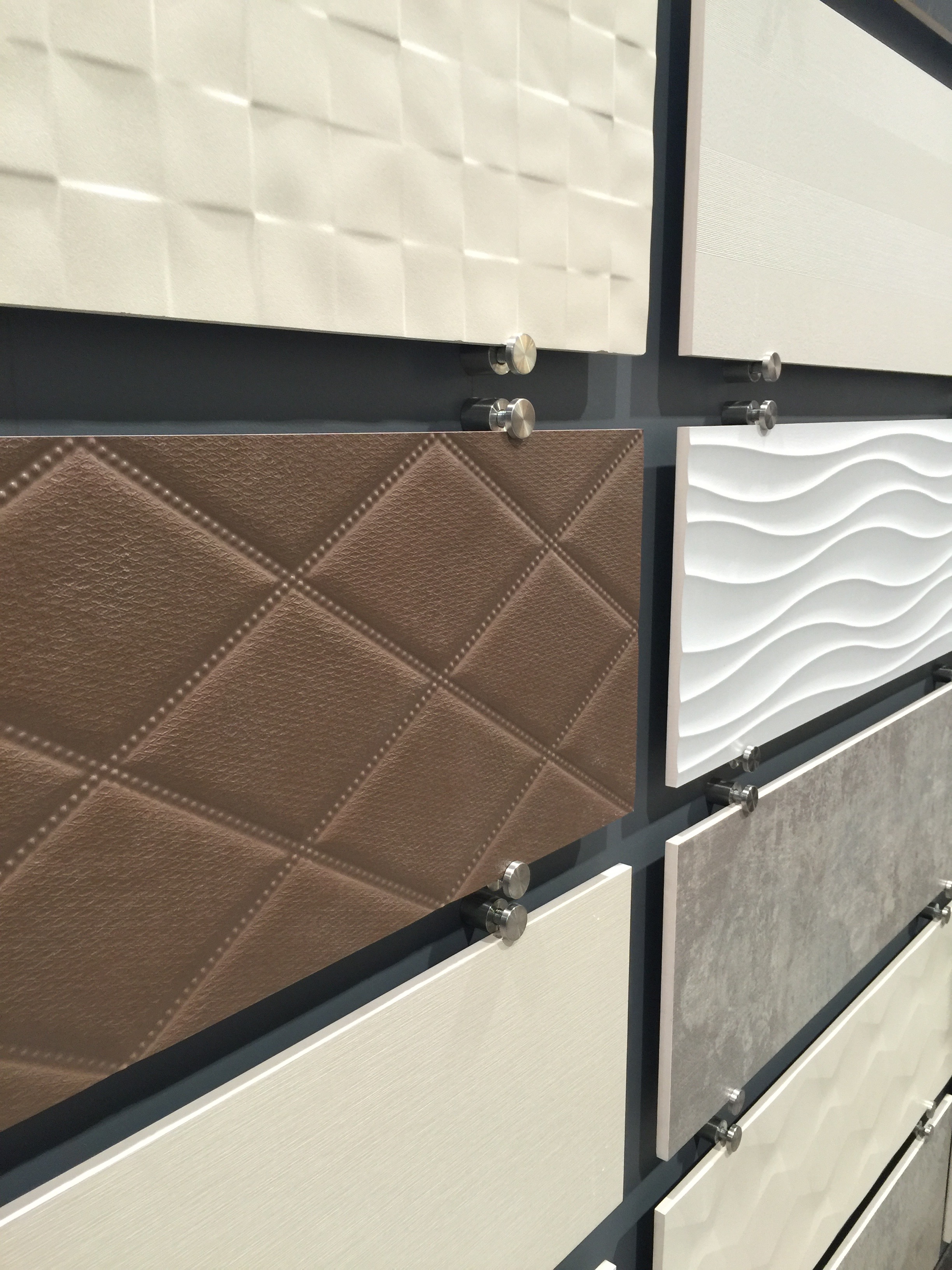
 Tile has made some significant advances in depth and texture specifically. Everything from tufted leather to wood patterns so real you have to touch it to be sure. As usual, tile brought beautiful patterns and heavy geometrics that pack a bold punch.
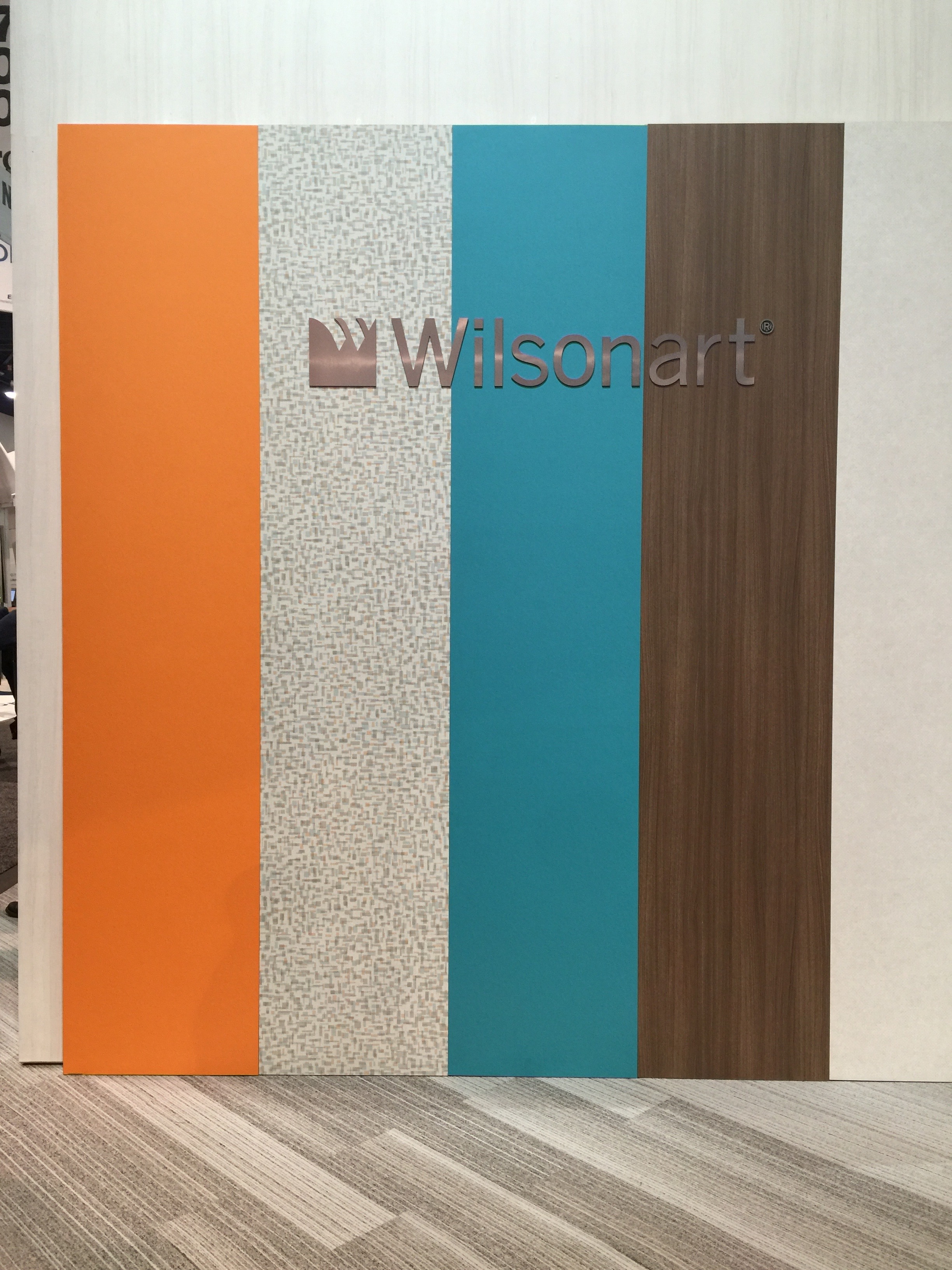
 Laminate products from companies like Formica and Wilsonart aren’t giving up either, with cheaper alternatives than stone products and 100 years of engineering under their belt. These products still have a place in the american home, even if it isn’t the kitchen countertop. We love laminates for mud room spaces, offices, and even wall coverings.
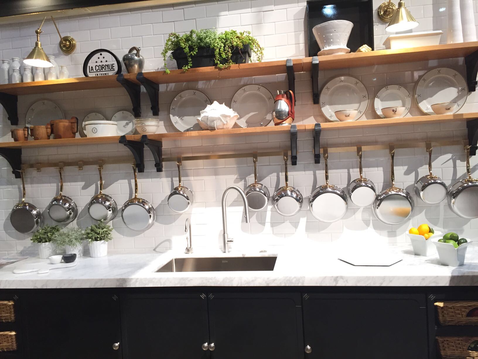
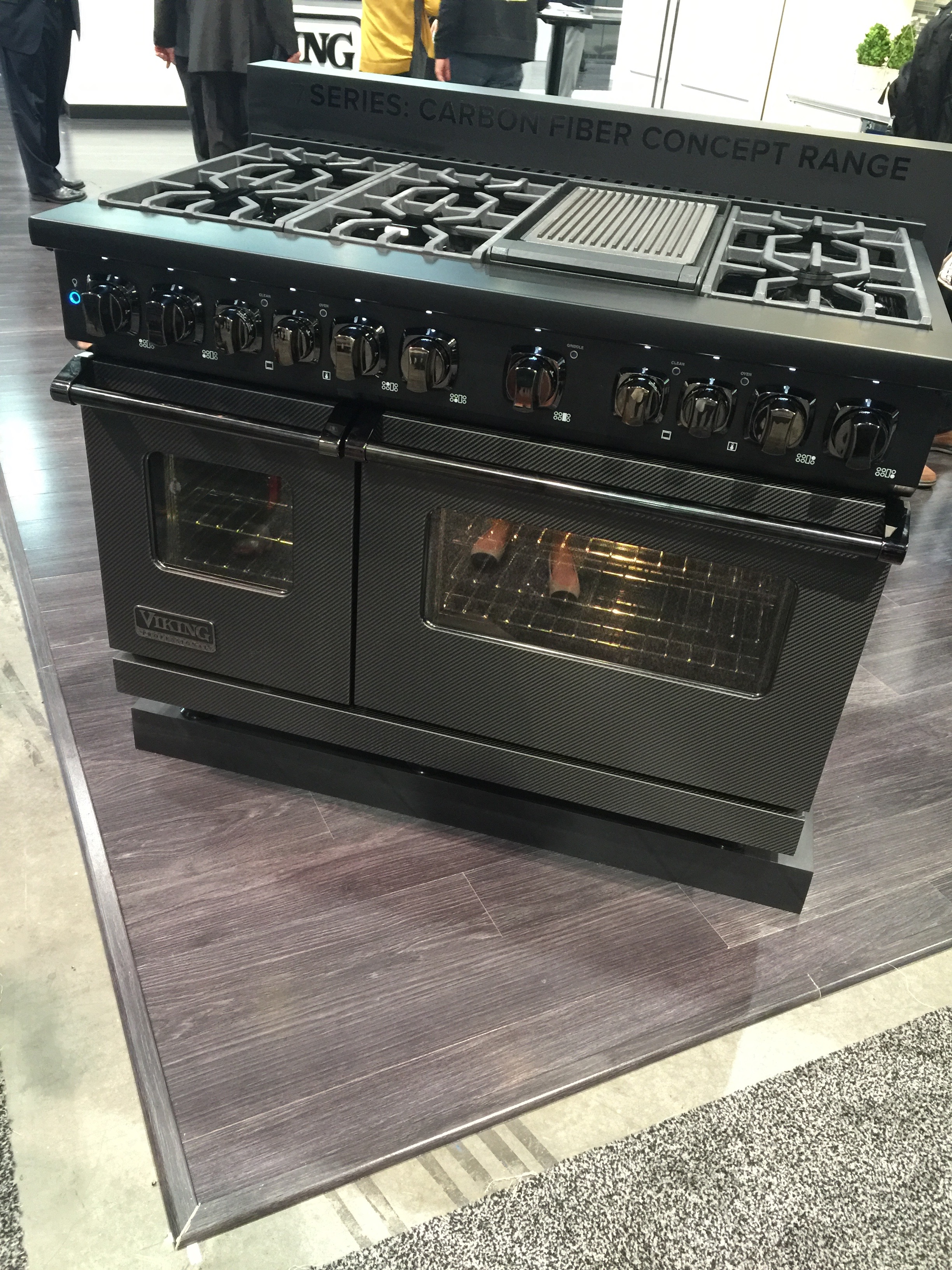
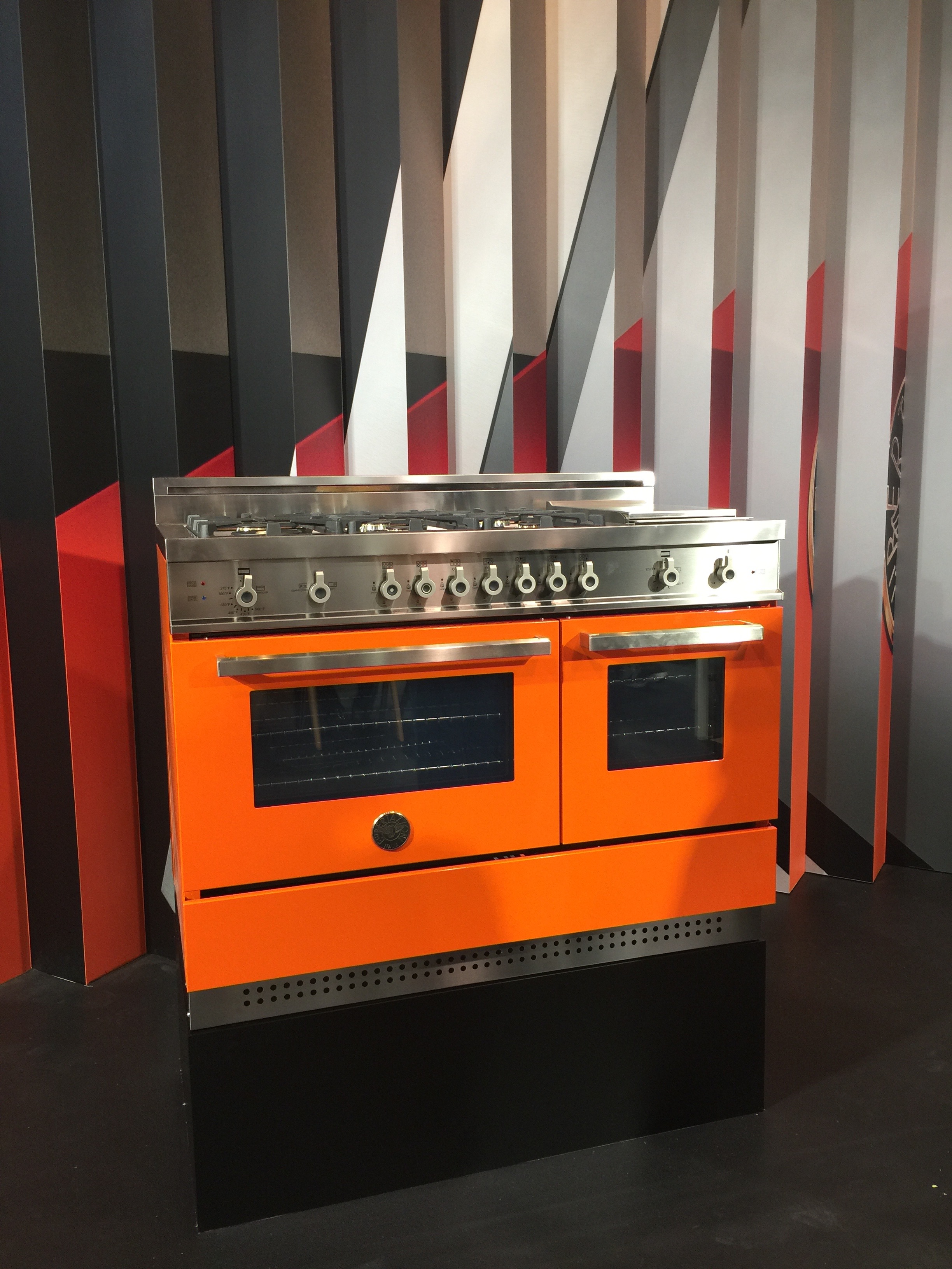
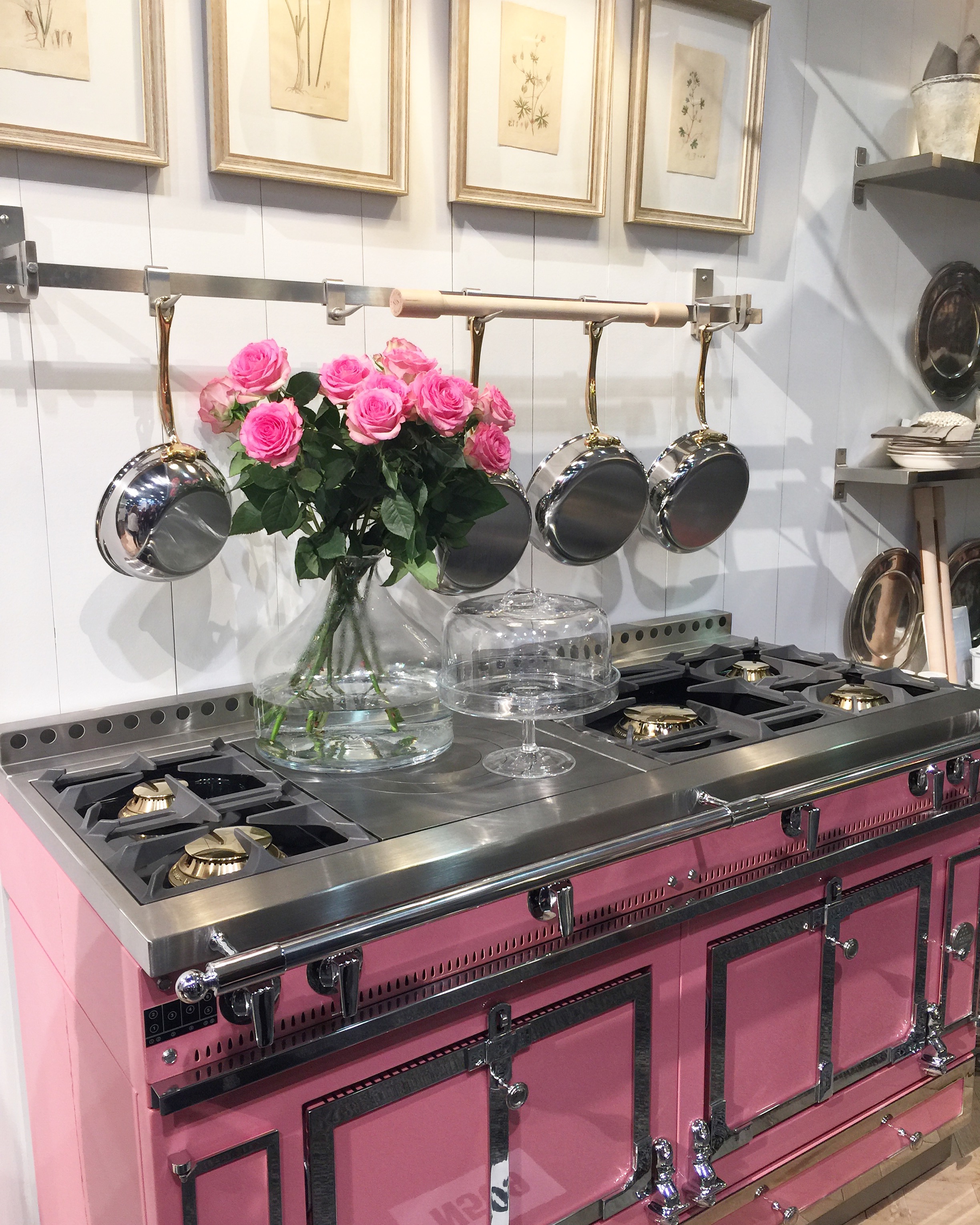 Appliances were a huge part of the show this year featuring more than just the fancy touch screens. Interactive displays with bluetooth technology allows you to have a professional chef in your kitchen every night of the week. Appliances are also no longer limited to stainless steel: bold color choices were on display from Bertazzoni and my particular favorite, the Barbie pink range from La Cornue. We are also seeing a heavy push for “the new stainless steel” and “black / charcoal / carbon fiber” looks like it is the next big thing. Almost all of the big appliance manufacturers are in the prototype stage and we believe we will start to see it roll into projects in the coming years.
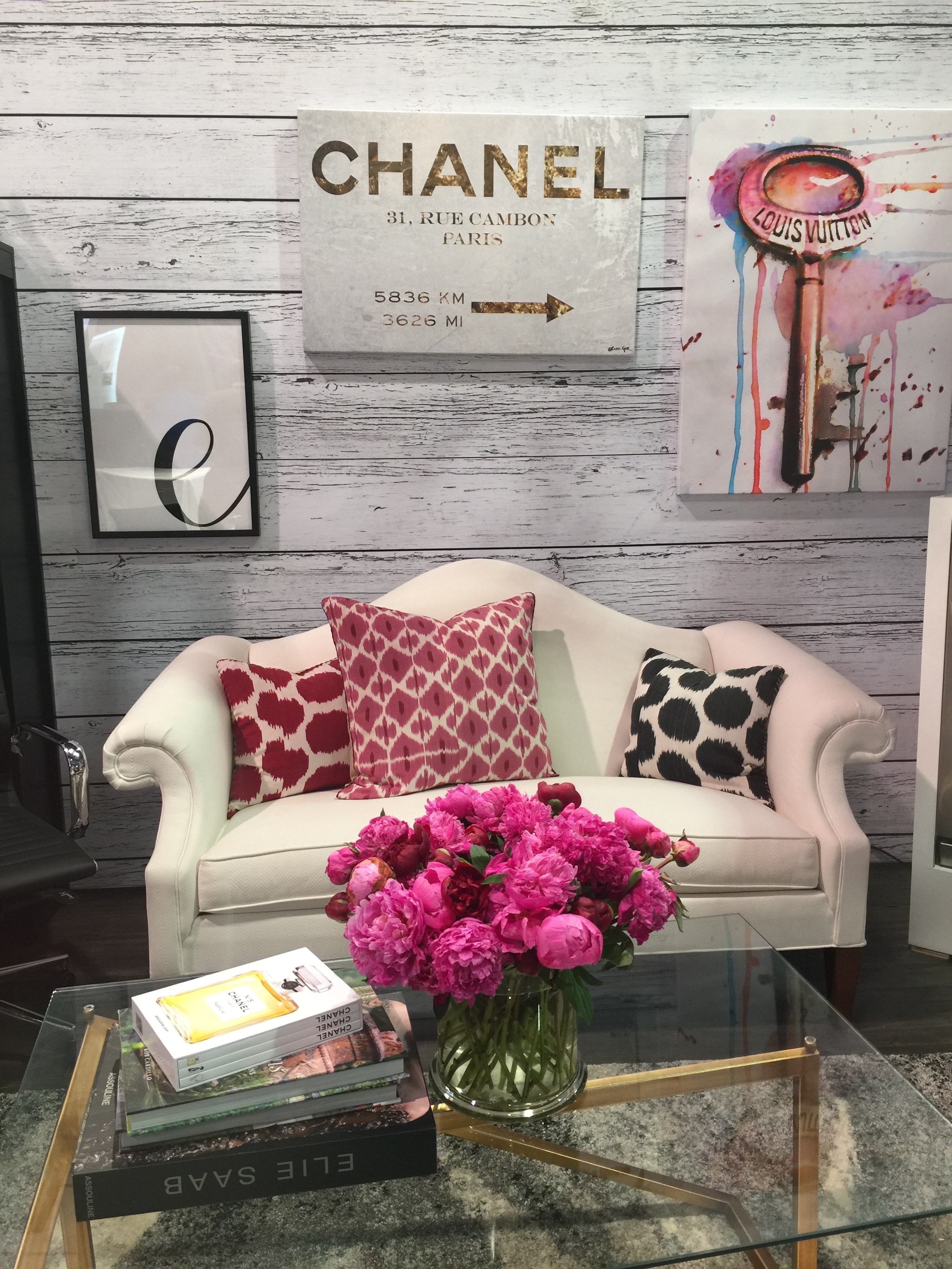
 The biggest question I get as a designer is “what’s hot?” and there are some clear trends progressing already in 2016. The pantone color of the year is actually two colors for the first time ever. Rose Quartz (blush pink) and Serenity (light blue-ish / purple) are setting the stage for our pops of color this year and we couldn’t be happier about it. Pink was EVERYWHERE at the show this year, cabinets, tile, and soft goods like sofas and window treatments. Even hardware has taken on a blush finish with light coppers and french brass finishes. Blues also made an appearance in every version of the color this year!
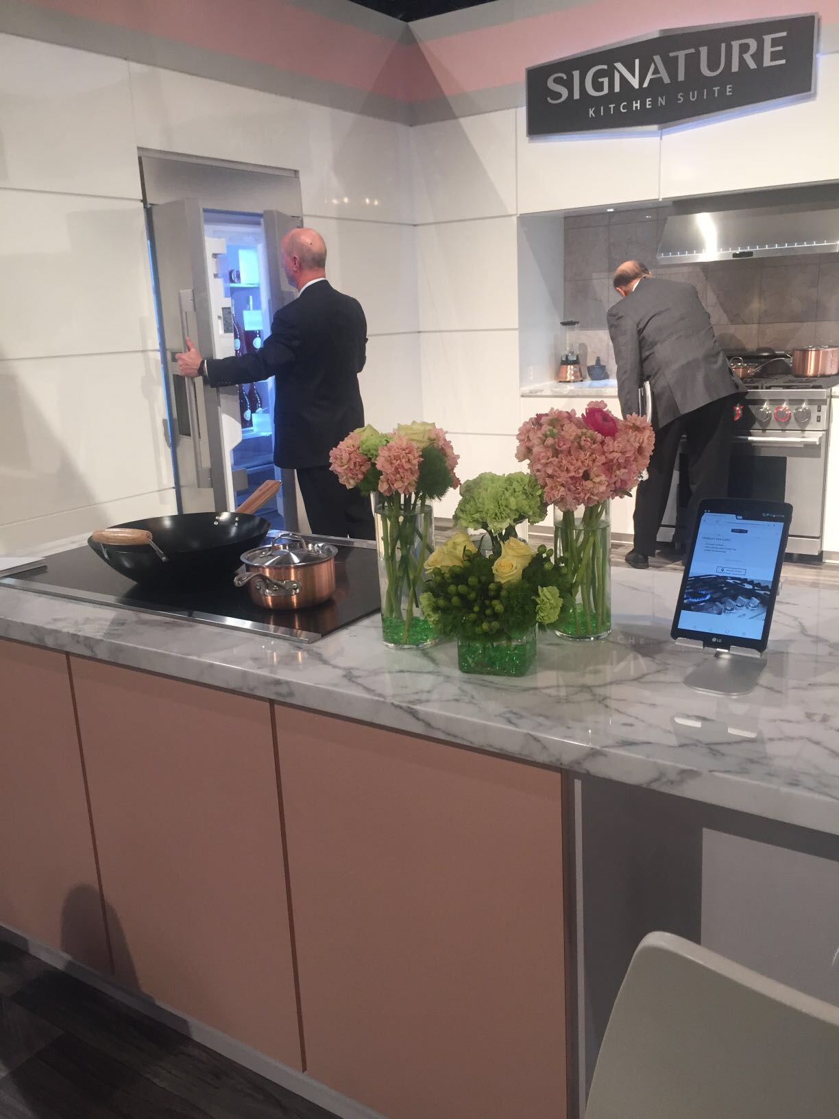
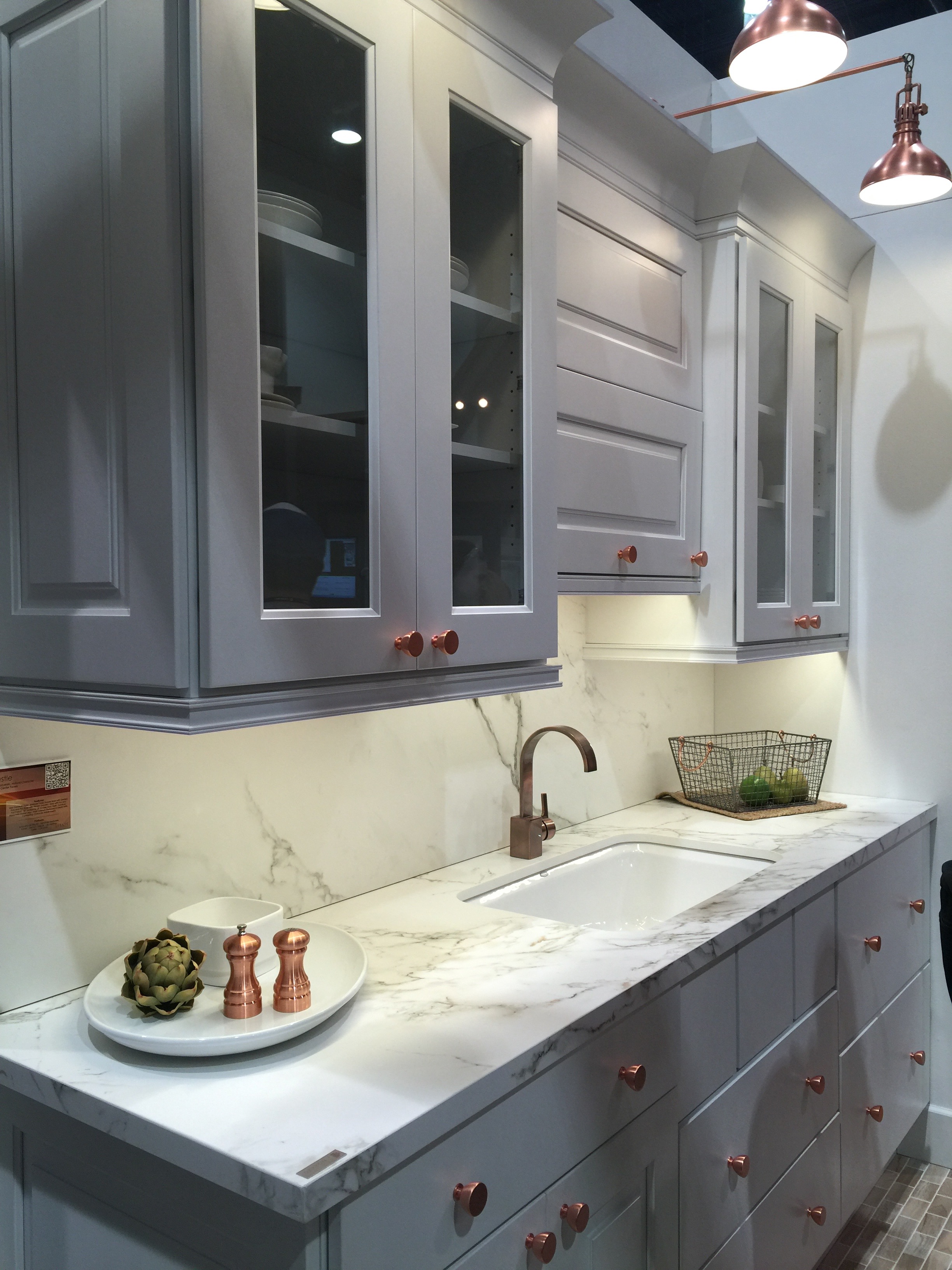
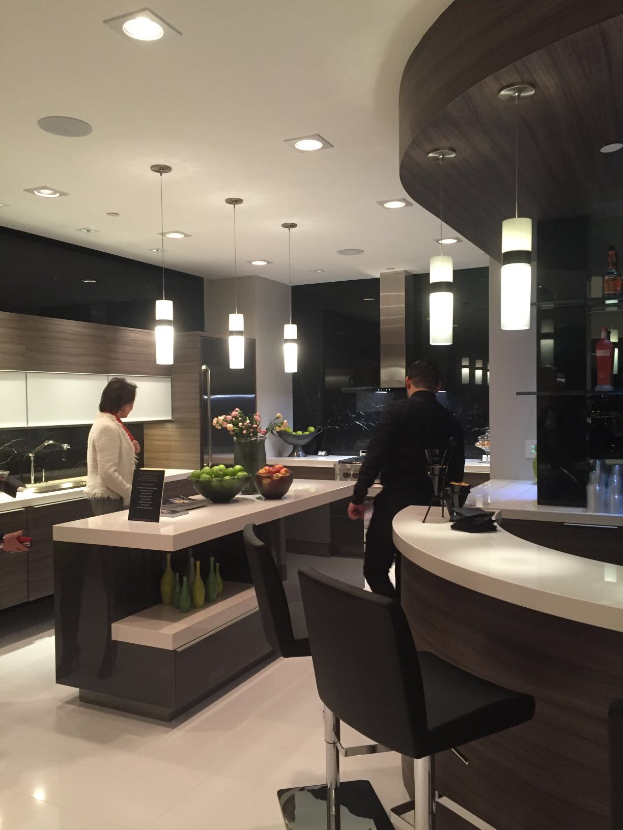
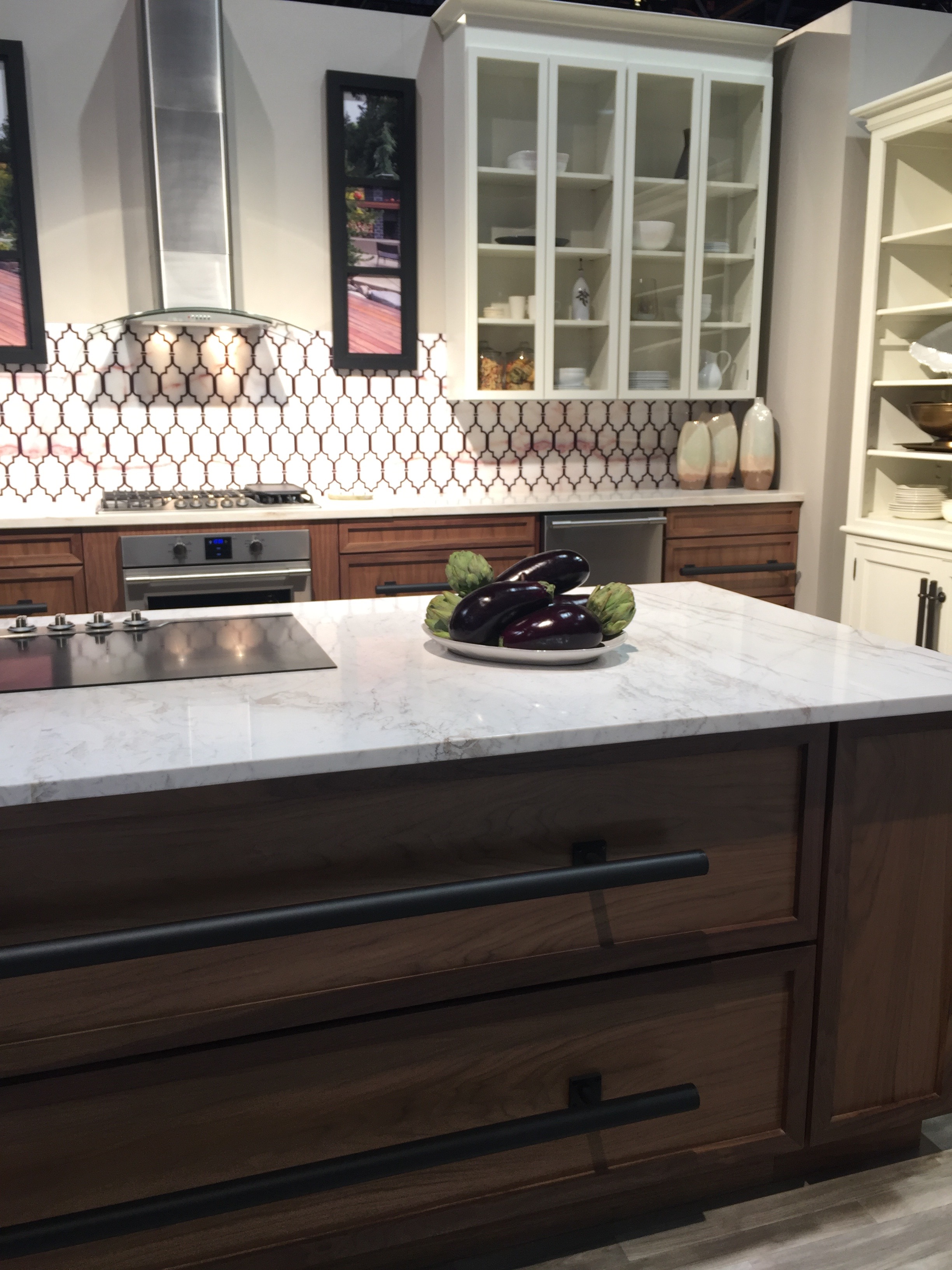 As far as the overall design style for the coming years there are a few things we noticed. “Transitional” style has dominated the market for years now and that certainly isn’t going anywhere but we are starting to see it shift slightly. Cleaner contemporary European styles are definitely supporting roles in 2016. Whites and grays are beginning to take a back seat to more “natural neutrals” that are still bright but with warmer undertones. We are now seeing warm rustic wooden floors paired with high gloss acrylics to create a style that is “approachable contemporary”. Mixing all of the neutral tones is still vastly popular as the primary color palette creating a polished yet comfortable living space. For fellow color lovers, do not fear! The simple color palettes leave lots of room for bold pops of color that can easily be switched out as you grow tired of them.
What are some of your favorite colors for 2016?
